MochiMeychi
Building a playful brand for a modern mochi business
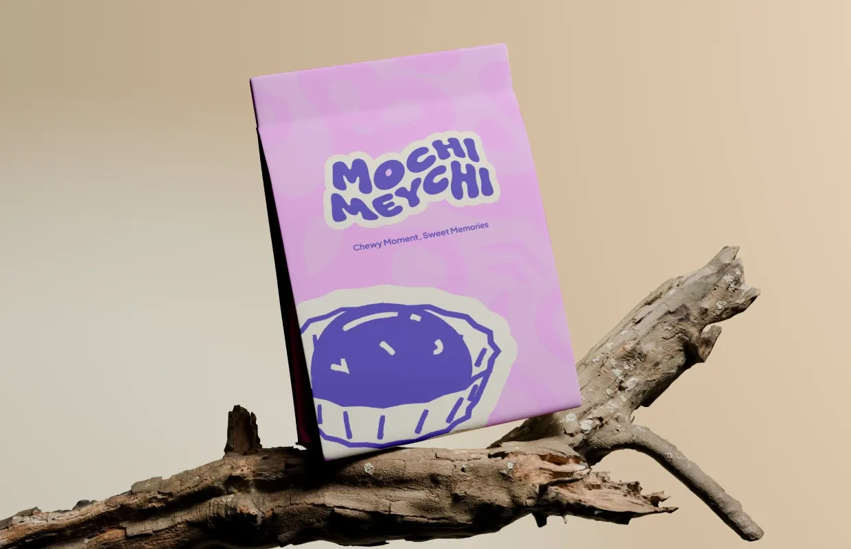
About the project
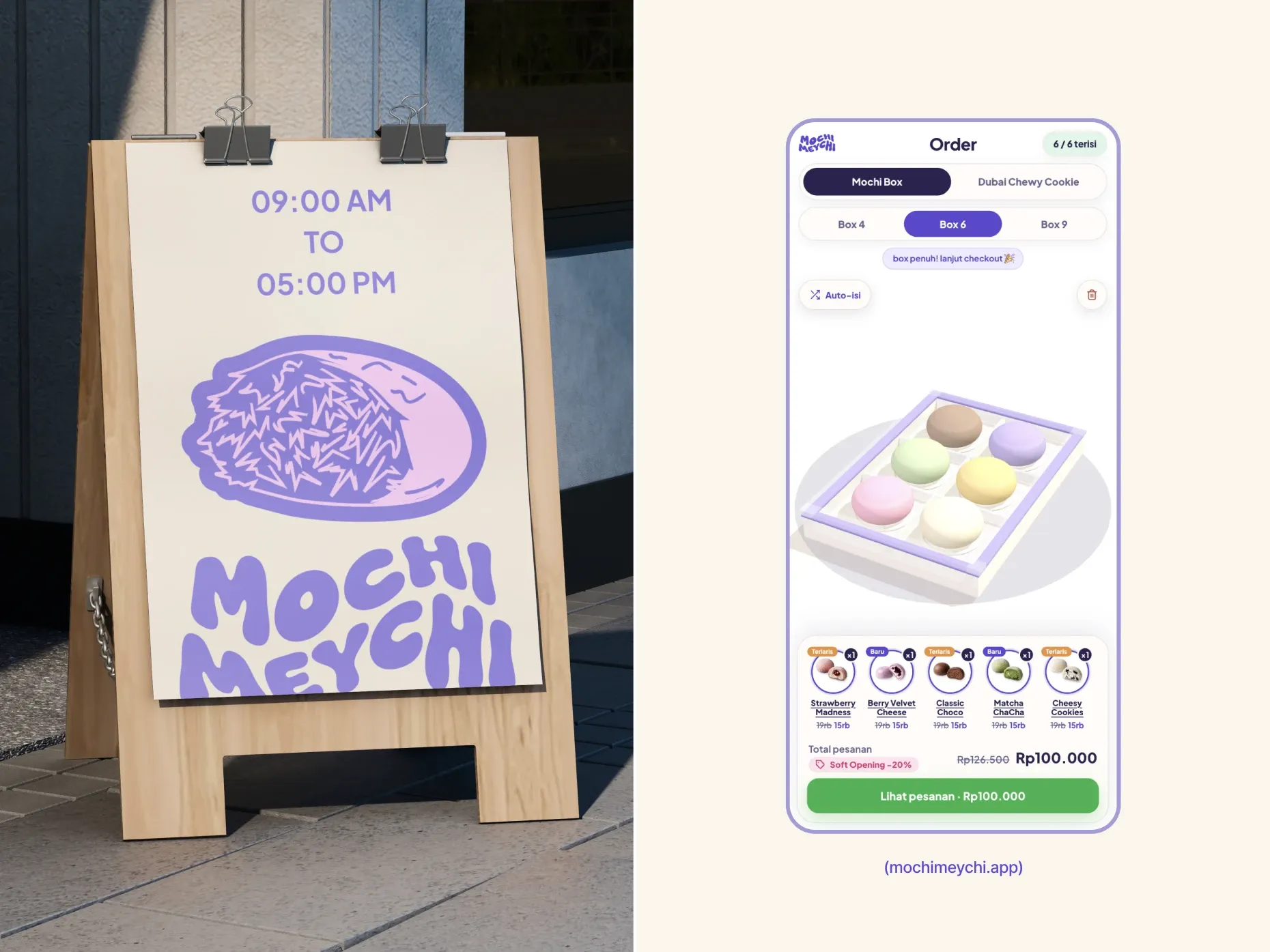
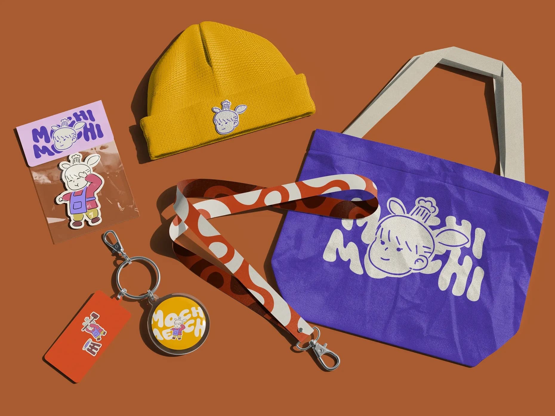
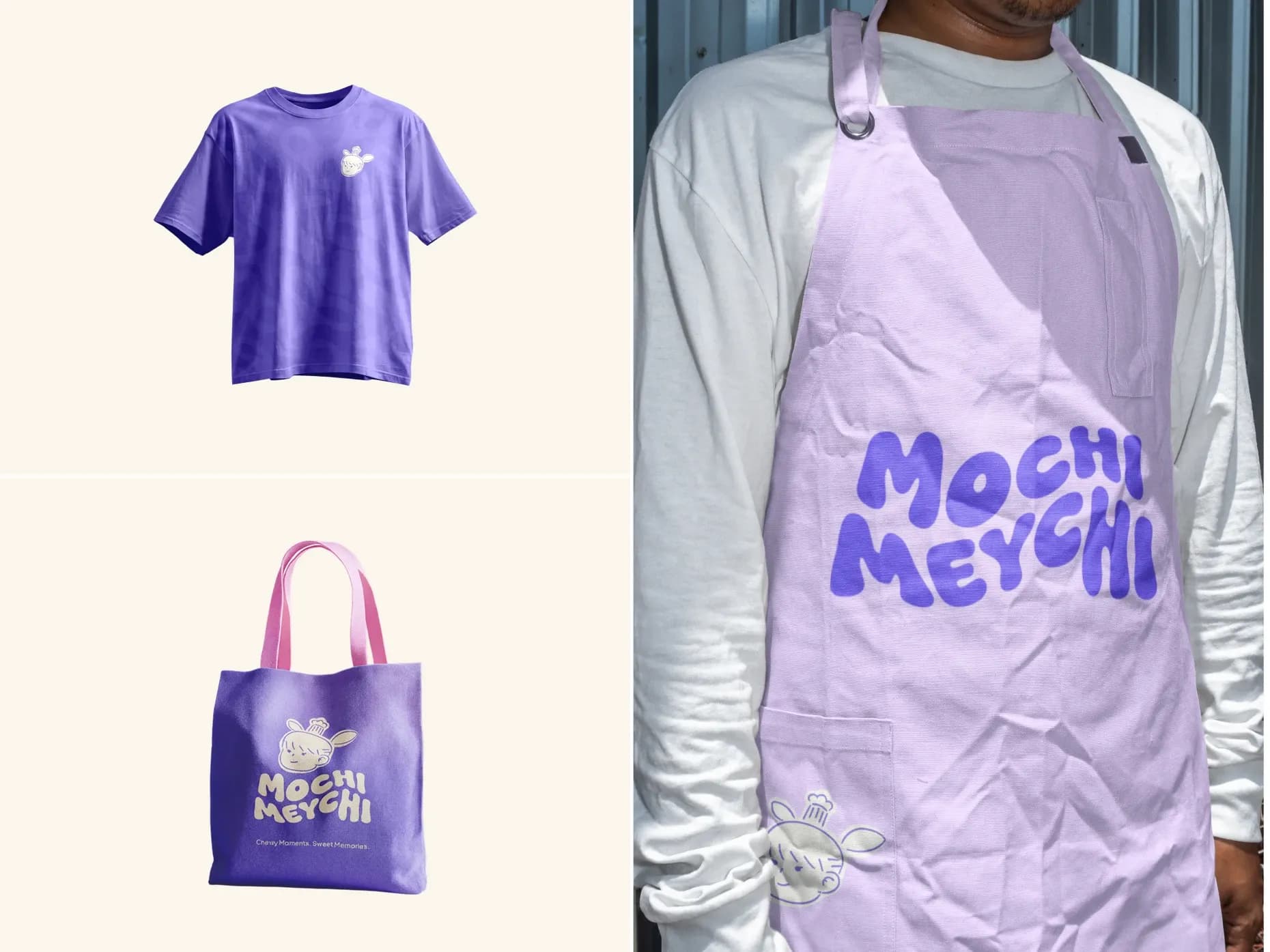
A modern dessert brand that pairs artisanal ingredients with bold, joyful design. Every detail — from flavors to packaging to digital presence — is built to spark joy. The challenge was standing out in a saturated F&B market by balancing premium quality with approachable fun, and translating the tactile, playful feel of physical products into a smooth e-commerce experience.
- More online orders completed
- 45%
- Social media engagement growth
- 3.5x
- Positive user feedback
- 98%
- Brand consistency across channels
- 100%
MochiMeychi
Brand foundations · Typography · Project timeline
01 / Color system
- Royal Iris
#5D46F2
CMYK 62%, 71%, 0%, 5% - Persimmon
#F05525
CMYK 0%, 65%, 85%, 6% - Champagne
#F1D9BD
CMYK 0%, 10%, 22%, 5% - Ivory
#FAF5EC
CMYK 0%, 2%, 6%, 2%
- Espresso
#461302
CMYK 0%, 73%, 97%, 73% - Cotton Candy
#F9D3FA
CMYK 0%, 16%, 0%, 2%
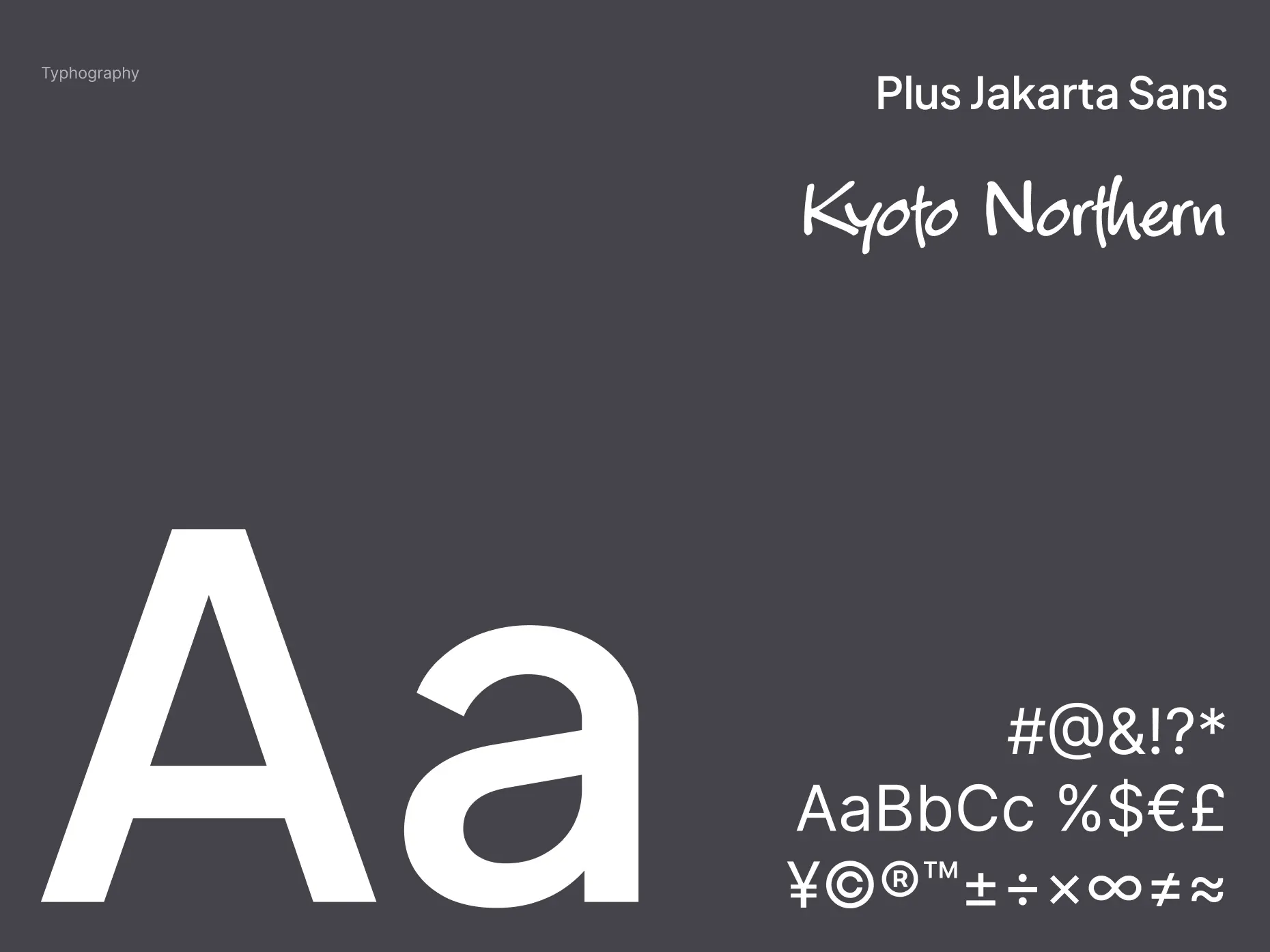
02 / Typography
Plus Jakarta Sans
Aa
ABCDEFGHIJKLMNOPQRSTUVWXYZ
abcdefghijklmnopqrstuvwxyz 0123456789
Paired with Kyoto Northern
Kyoto Northern
Aa Bb Cc 0123456789
ABCDEFGHIJKLMNOPQRSTUVWXYZ
abcdefghijklmnopqrstuvwxyz
0123456789 !@#$%&()
03 / Project timeline
June - September
JuneJulyAugustSeptember
- Discovery & Research
- Visual Identity System
- Brand Strategy
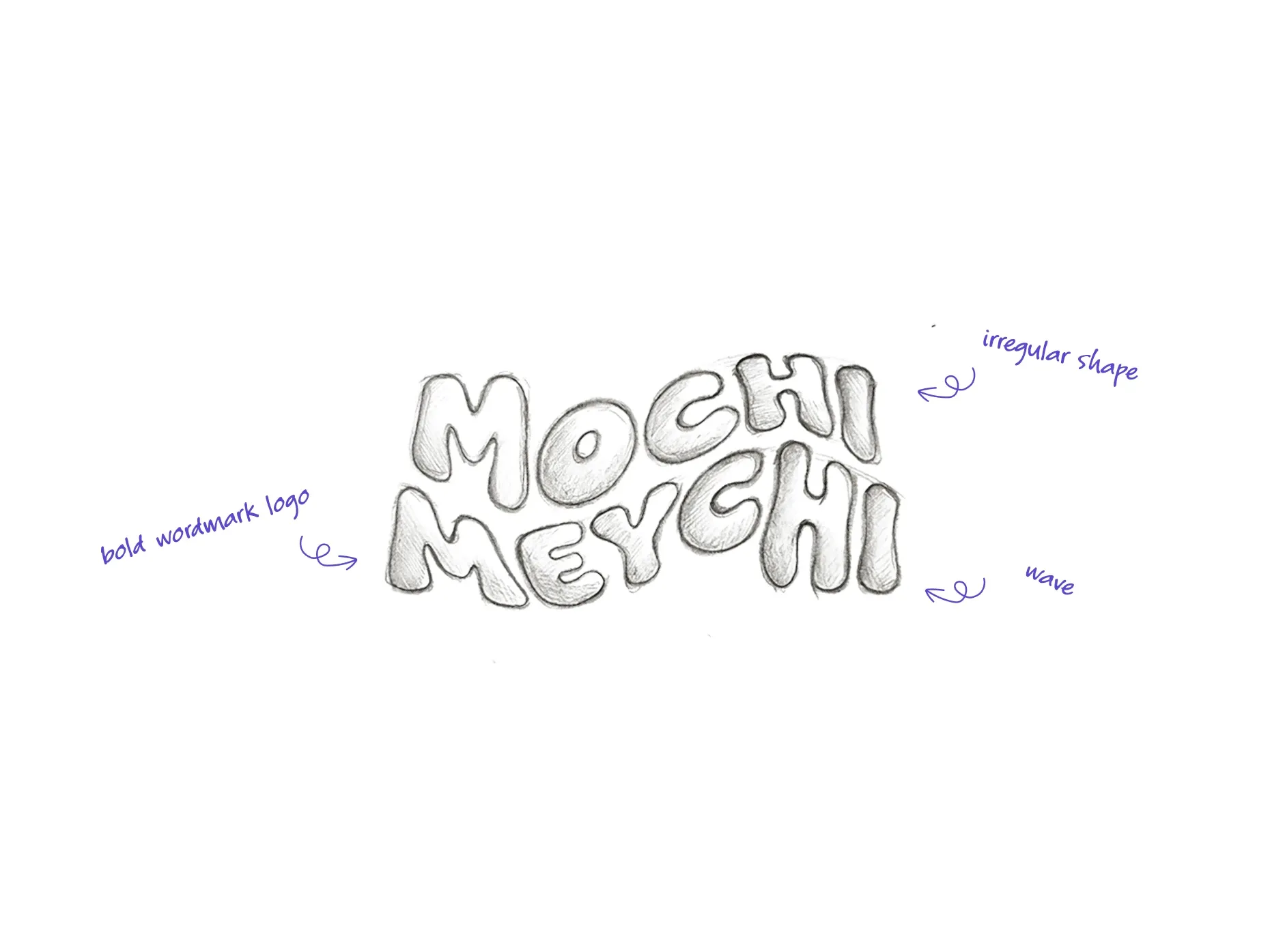
- Logo Exploration
- Refinement
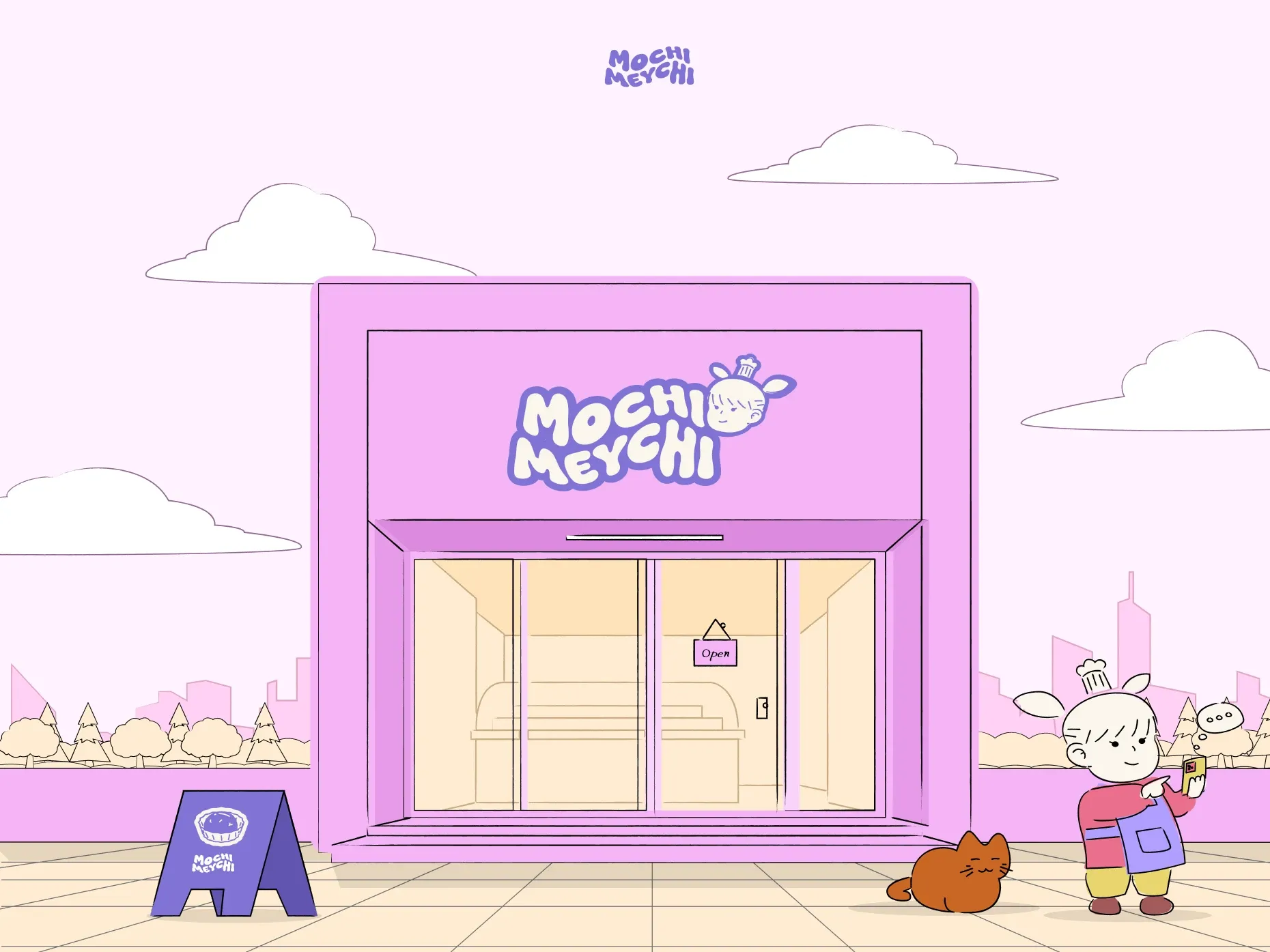
- Mascot Design
- Delivery
CLIENTS
They captured exactly what MochiMeychi needed: playful enough to spark joy, but polished enough to feel premium. The brand, packaging, and online shop now feel like one delicious experience.
MeychiFounder of MochiMeychi